TOC
The Problem - it is difficult to visualize a lot of time series data in a meaningful way
Geologist and engineers use time series production data for many tasks. Plotting production volume over time allows them to compare the performance of different reservoirs (or different parts of a single reservoir), as well as look at the structure of the reservoir (e.g., contribution of from primary or secondary porosity). A main problem with time series data is that it has two dimensions that are very costly to visualize as both dimensions are continuous. If a spatial component is added, then the analysis gets two to three dimensions more difficult. Geologist and engineers often visualize time series production data in two ways, each with its own limitations:
- Line plots - line plots allow for the change in production to be visualized over time by plotting time on the x-axis and produced volume on the y-axis. Some form of spatial component could be added by coloring lines or stacking multiple curves on top of each other. However, if too many lines are added, the interpretability rapidly decreases and the spatial information is lost.

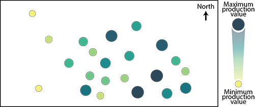
- Bubble plots - bubble plots are used to retain the spatial component of production dataset, where individual bubbles/circles are plotted at the location of each well and the radius of the bubble/circle is used to demarcate the production volume of a specific fluid. This approach highlights the spatial component, however the shape of the curve is lost, as only a summary statistic can be visualized (e.g., total gas produced, production over first 5 years).
Time series classification through dynamic time warping
Dynamic time warping (DTW) calculates the optimal match between given time series. First, input curves are scaled along the y-axis to provide a uniform measure of height. Other shape-based clustering take raw y-value into account - it depends if you think the value is a component of the “shape”. Then, data points from input curves are correlated to each other but are allowed to correlate forward or backward in time. The further the correlation is forward or backward, the larger the correlation is penalized. Each curve is assigned to the classification/cluster with the minimum penalty. Similar to other other unsupervised classification methods, this is done in a number of iterations, where the the correlations of the input curves as well as the curves that defines each cluster/class (centroids) are modified slightly each iteration. This promotes a best fit that minimizes the cumulative penalty.

DTW allows for similar but not identical curves to be part of the same cluster. For example, if two production curves that both plateau in production, however one plateaus 5 years from start of production and the other 15 years from the start of production, these two curve may have similar shapes but are not identical. Similarly, normalization of the y-axis allows for similar shapes to be extracted even though the total volumes may be significantly different. Lastly, a shape-based approach allows for the time series to be different length, which is great for wells with different production lifespans.
Business case - identifying under-perfoming reservoirs
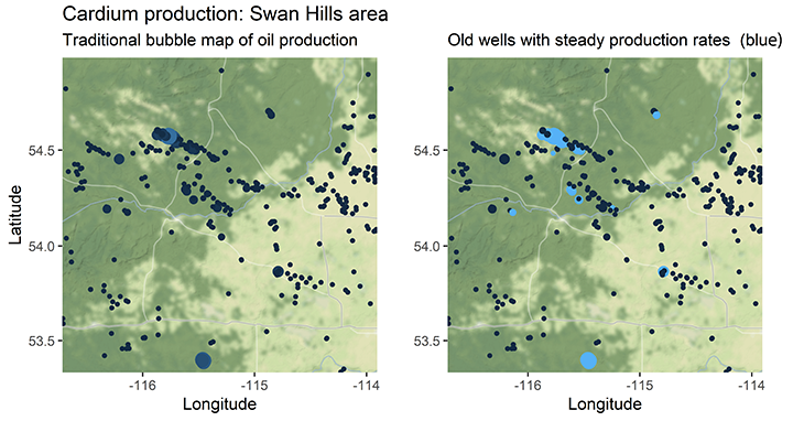
In many cases, bubble maps that represent the total volumes of produced fluids are used to highlight high-performing areas of reservoirs to target or investigate. Areas of low production are often ignored and and thought as non-prospective. If these areas of low production are steadily producing, however, they could become economic if they are attached to a large enough reservoir volume and are completed with modern completion techniques (e.g., multistage horizontal wells).
The main goal of this project is to use data filtering, time series clustering, and spatial buffering to highlight areas where we may have low, yet steady, production from a potentially large volume that could be enhanced using modern completions.
After cleaning the production history for all of Alberta (which is in a wild format btw, check it out here) and joining additional information (e.g., bottom-hole location and licensed formation), the data could be filtered to a specific formation/pool and visualized in a traditional bubble plot. Additional filters like spud date, maximum yearly production volume, minimum rate, number of production years were used to reduce the dataset to a more meaningful list of older wells with low, sustained rates of production. The example below is of the Cardium Formation, Alberta.
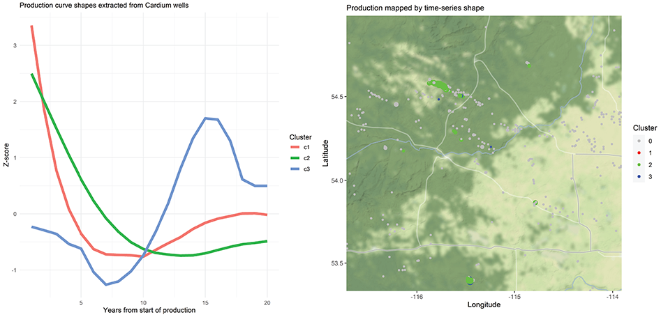
The dataframe consisting of older, steadily producing wells was used as the input for the dynamic time warping algorithm and three time series centroids were extracted. The centroids range from steep or moderate decline (clusters 1 and 2, respectively) to largely flat with some undulation (cluster 3). Cluster/centroid 3 effectively represents a flat/steady production curve with a peak somewhere within the profile. Because shape-based dynamic time warping can be thought of as stretching and squeezing the data along the y-axis, wells of cluster 3 will have differing rates of production but similar low profile shape. Once extracted, wells can be mapped by production volume (radius) and time series shape (colour) as seen below.
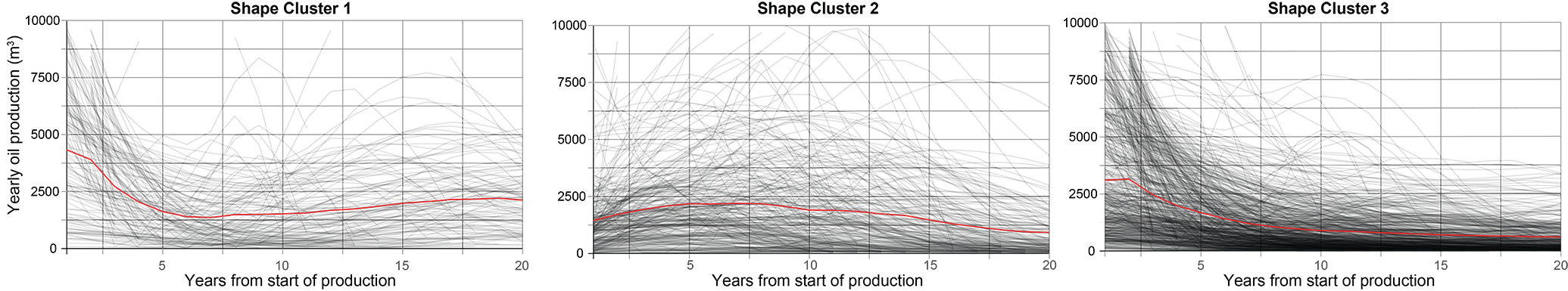
When the production curves are visualized in terms of volume (y-axis of volume rather than z-value/shape statistic) the variation of the curves within each shape cluster is very apparent. This likely stems from the input curves being scaled on the y-axis prior to classification. Scaling allows for more generalized shapes to be extracted but leads to this binning of high-volume wells and low-volume wells. The red line in the plots below represents the mean production of each cluster, however, given the range of values in each shape cluster, the mean is almost useless…
The goal of the project was to high-grade areas composed of older wells with steady/flat production profiles. From the analysis above, shape cluster 3 has that flat production profile, espeically at lower volumes. To find areas of lonesome shape cluster 3 wells, a 3 km spatial buffer was applied. This spatial buffering exercise returned a list of 12 wells that could be investigated further to see whether modern completion techniques could be used to enhance the production. This analysis was only for the Cardium Formation (Alberta, Canada) but could easily be applied to a different formation or a specific pool and for other fluids. Confounding factors like injection rates and timing of cleanouts would likely just be handled on a case-by-case basis once a certain formation was high-graded.
Applications to other time series datasets
Datasets composed of time series that have some form of spatial component are very common. Additionally, humans gravitate towards maps for to analyze spatial data. Because of this, the unsupervised classification of time series data could be useful to not only cluster these complex data, but allow those shapes to be added to maps via colour. Some examples of other use cases for dynamic time warping include:
- Satellite remote sensing - Identifying patterns in vegetation or land use over time - extracting cluster centroids from the pixels of a raster image.
- Electricity regulators or suppliers - Classifying power generation or use curves - extracting cluster centroids from a database of customer data.
- Business intelligence - Identifying patterns in revenue over time for different business locations - extracting cluster centroids from a revenue database.
Summary and where to find my code
Dynamic time warping methods are an interesting way to collapse time series data into distinct profiles in an unsupervised fashion. Once the time series are classified, one can begin to look for relationships within and between the classes. These classes can then be easily translated to a map where point colours might symbolize the shape of the time series. For production data, there are many extensions to this work. A major one being the derivation or validation of type curves within a certain formation or pool.
Here is the link to the GitHub repository where I’ve stashed an R notebook for this sort of process. I’m currently cleaning up this code into a more user friendly form and storing it here. Feel free to reach out if you’re interested in how to apply this work to a specific dataset or want to work together on implementing it.